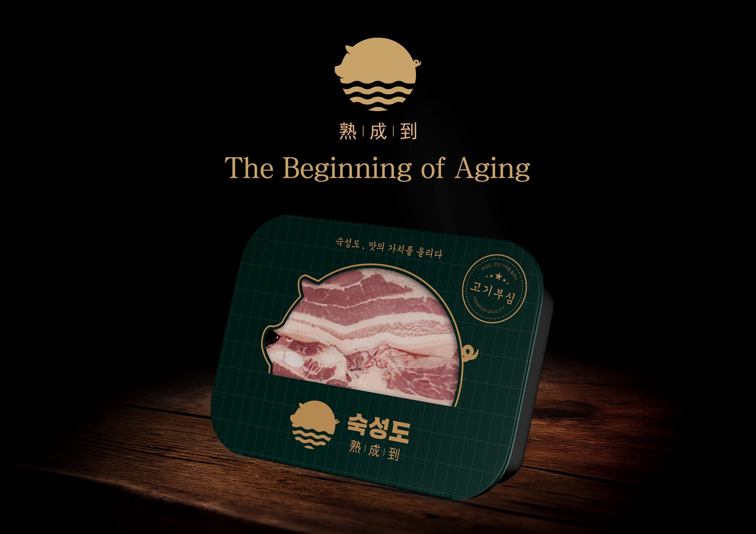
This sleeve packaging was designed for a premium aged pork brand from Jeju Island, known for its dedication to enhancing the flavor of pork to its absolute best. The challenge was to highlight the brand’s unique color palette—green and gold—while creating a visually appealing and functional design.
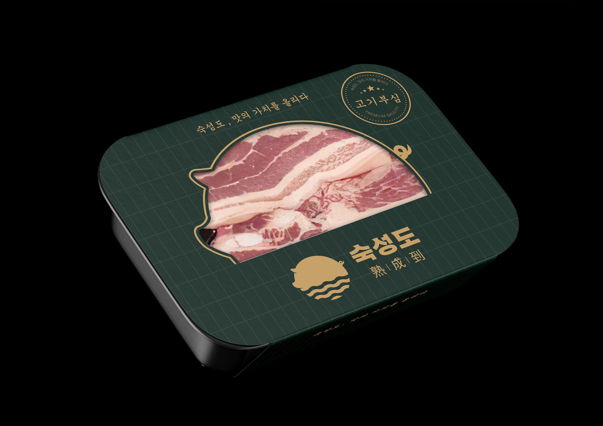
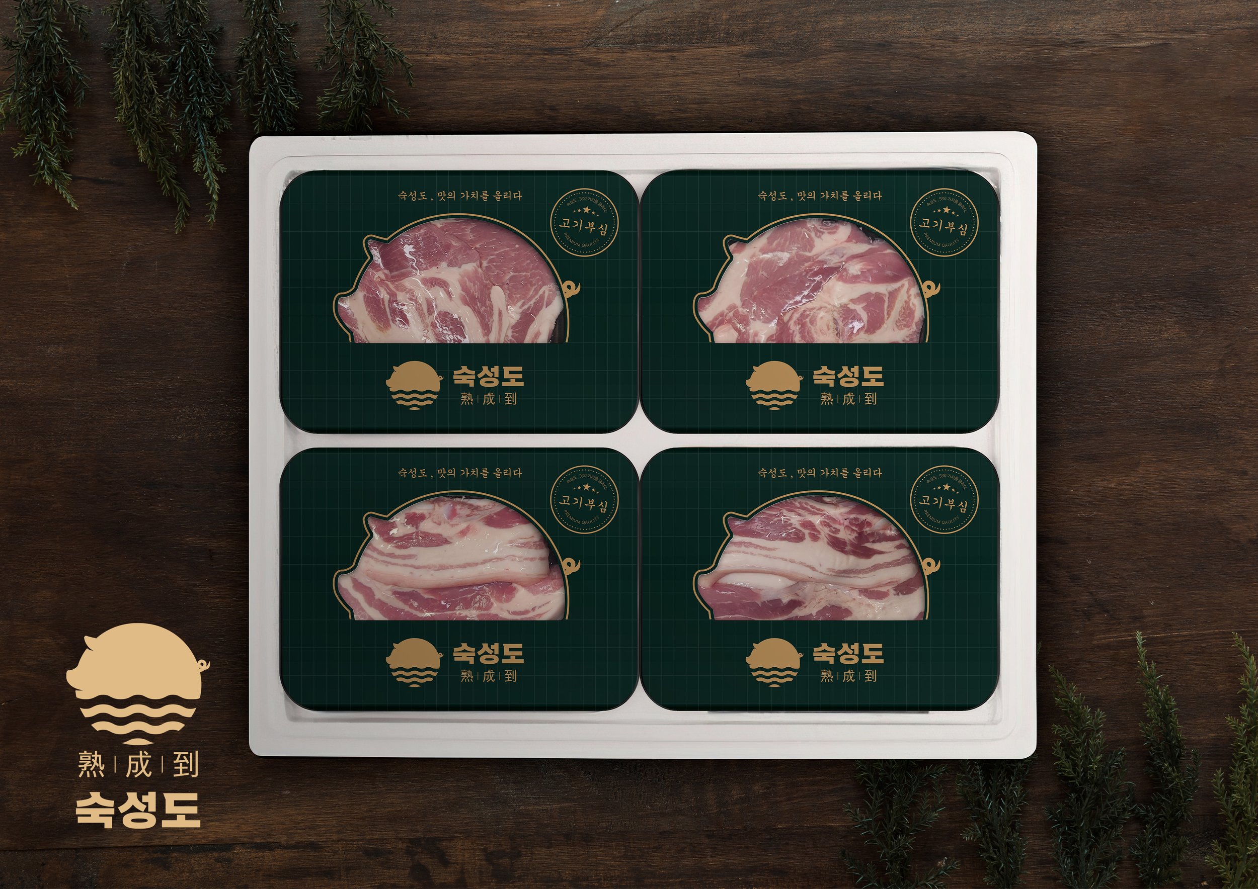
A key feature of the packaging is the perforation shaped like the brand’s iconic pig logo, allowing consumers to see the fresh meat inside. This design element not only reinforces the brand’s identity but also enhances the customer experience by offering a glimpse of the product’s freshness.


Project Goal
The aim of this project was to design a sleeve packaging that could represent the brand as an iconic product itself. The goal was to visually express the brand’s deep pride in its aged pork and its commitment to delivering maximum flavor. The packaging needed to strike a balance between luxury and authenticity, reflecting the brand’s dedication to high-quality meat without compromising on its message.
Design Journey
Throughout the design process, it became clear that the packaging had to stay true to the brand’s identity while remaining visually appealing. To achieve this, only the brand’s iconic green and gold colors were used, avoiding additional colors to maintain focus. The branding was kept minimal by reducing excessive text on the front of the package, with the intent of letting the product and its message speak for themselves. A major design choice was incorporating the brand's pig logo as a perforation to showcase the freshness of the meat inside. However, we soon realized that this perforation could lead to tearing during production, which posed a challenge.
Design Solution
To address the potential for tearing, a solution was developed by modifying the design without losing its integrity. The tail of the pig, which was prone to tearing, was replaced with a graphic instead of a perforation. This adjustment helped prevent damage during the production process, minimizing loss and ensuring smooth manufacturing. The overall design stayed true to the brand’s essence, highlighting both its luxury and sincerity while offering consumers a glimpse of the high-quality meat through the strategically placed perforation.